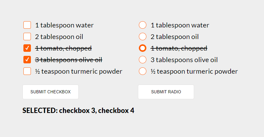
Dzisiaj będzie o stylowaniu radio oraz checkbox butonów. Przykład jest w połączeniu z przekreślaniem treści, przydało się ostatnio w budowaniu składników przepisów.
Zacznę od html, są to dwa formularze z butonami po kliknięciu których wstawimy w h3 te opcje (value) które zaznaczyliśmy.
Poniżej skrócona wersja html, zaś na samym końcu wpisu cały przykład w codepen.io
<div class="flex all-form">
  <form id="form-checkbox">
    <div class="flex flex-format">
      <div class="form-element">
        <label class="custom-element">
          <input type="checkbox" value="checkbox 1">
          <div class="checkbox">1 tablespoon water</div>
        </label>
      </div>
      <!-- ... -->
      <button type="submit" class="submit">SUBMIT CHECKBOX</button>
    </div>
  </form>
  <form id="form-radio" class="flex">
    <div class="flex flex-format">
      <div class="form-element">
        <label class="custom-element">
          <input type="radio" name="ingredients" value="radio 1">
          <div class="radio">1 tablespoon water</div>
        </label>
      </div>
      <!-- ... -->
      <button type="submit" class="submit">SUBMIT RADIO</button>
    </div>
  </form>
</div>
<h3></h3>
Teraz trochę css 😉
Tworzę na pseudo-elementach w div a dokładnie dla klasy radio oraz checkbox ::before oraz ::after, dlatego że przez ~ [tyldę] możemy zaznaczyć następny element. Niestety nie istnieje sposób na zaznaczenie elementu poprzedzającego, tzn. istniał bardzo dawno temu ale obecnie nie działa - parent selector
/* najpierw importujemy czcionkę */
@import url("https://fonts.googleapis.com/css2?family=Lato:wght@400;900&display=swap");

body {
  font-size: 1.6rem;
  padding: 30px;
  background: #eeeeee;
  font-family: "Lato", sans-serif;
  font-size: 1.2rem;
}

/* style dla bytonów */
button {
  margin-top: 20px;
  padding: 15px 20px;
  cursor: pointer;
  width: 180px;
  border-radius: 5px;
  border: 1px solid #dfdfdf;
  background: #fff;
  transition: box-shadow 200ms, border 200ms ease-in-out;
}

button:hover {
  border: 1px solid #c3c3c3;
  box-shadow: 0 0 10px rgba(0, 0, 0, 0.1);
}

/* margines dodajemy do drugiego formularza */
form + form {
  margin-left: 50px;
}

.flex {
  display: flex;
}

.flex-format {
  flex-direction: column;
  justify-content: center;
  align-items: flex-start;
  gap: 10px;
}

.custom-element {
  position: relative;
  cursor: pointer;
}

/* odsuwamy tekst od radio/checkox oraz ustawiamy czcionkę */
.checkbox,
.radio {
  position: relative;
  margin-left: 40px;
  font-size: 1.4rem;
}

/* tworzymy wygląd butonów radio/checkox */
.checkbox:after,
.radio:after {
  position: absolute;
  content: "";
  left: -40px;
  border-radius: 4px;
  top: 0;
  width: 22px;
  height: 22px;
  border: 1px solid #ff5e00;
  background: #ffffff;
  transition: border 200ms, background 200ms ease-in-out;
}

/* checkoxy zaokrąglamy */
.checkbox:after {
  border-radius: 4px;
}

/* radio tworzymy koło */
.radio:after {
  border-radius: 50%;
}

/* każdy z elementów input ustawiamy opacity na 0 */
input[type="checkbox"],
input[type="radio"] {
  position: absolute;
  width: 22px;
  height: 22px;
  opacity: 0;
}

/* checkox ustawiamy środek na ✔ */
input[type="checkbox"]:checked ~ .checkbox:before {
  position: absolute;
  content: "\002714";
  top: 1px;
  left: -34px;
  font-size: 1rem;
  color: #fff;
  z-index: 1;
}}

/* wspólny styl dla radio/checkbox */
input[type="checkbox"]:checked ~ .checkbox:after,
input[type="radio"]:checked ~ .radio:after {
  background: #ff5e00;
}

/* dajemy przekreślanie teksów gdy elementy są ustawione na checked */
input[type="checkbox"]:checked ~ .checkbox,
input[type="radio"]:checked ~ .radio {
  text-decoration: line-through;
}

/* radio ustawiamy środek na ⬤ */
input[type="radio"]:checked ~ .radio:before {
  position: absolute;
  content: "\2B24";
  top: 3px;
  left: -36px;
  font-size: 1.1rem;
  line-height: 100%;
  color: #fff;
  z-index: 1;
}
Teraz część z js
// uchwyt do formularzy po id
const formCheckboxs = document.getElementById("form-checkbox");
const formRadios = document.getElementById("form-radio");

// pobieramy wszystkie elementy radio oraz checkbox
const checkboxs = document.querySelectorAll('input[type="checkbox"]');
const radios = document.querySelectorAll('input[type="radio"]');

// uchwyt do h3
const h3 = document.querySelector("h3");

// funkcja za pomocą której wstawiamy zaznaczone
// elementy do h3
function formElements(event, elements) {
  event.preventDefault();

  // pobranie wszystkich zaznaczonych elementów (checked)
  const checked = [].slice
    .call(elements)
    .filter((element) => element.checked)
    .map((element) => element.value);

  // wstawienie zaznaczonych elementów do h3
  h3.textContent =
    checked.length > 0 ? `SELECTED: ${checked.join(", ")} ` : "SELECTED: 0";
}

// akcja na kliknięcie
formCheckboxs.addEventListener("submit", (event) => formElements(event, checkboxs));
formRadios.addEventListener("submit", (event) => formElements(event, radios));
I to tak naprawdę na tyle. Poniżej cały działający przykład.
See the Pen
Styling Checkboxes and Radio Buttons by Greg (@Tomik23)
on CodePen.